Overview
The Ministry of Education recently updated its main website, education.govt.nz. The goal was to create a modern, user-friendly site that better aligned with up-to-date ministrys branding.
The new site was built on Drupal CMS (content management system), allowing different ministry groups to load and manage their own content.
My team's task was to create a set of reusable components that gives content loaders the tools to create various pages across the site.
| My role | UX/UI Designer |
|---|---|
| My Tasks |
|
| Tools |
|
Challenges
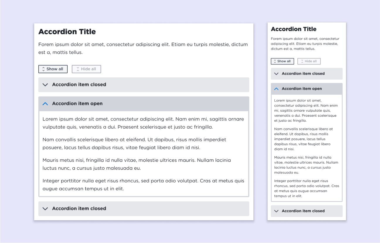
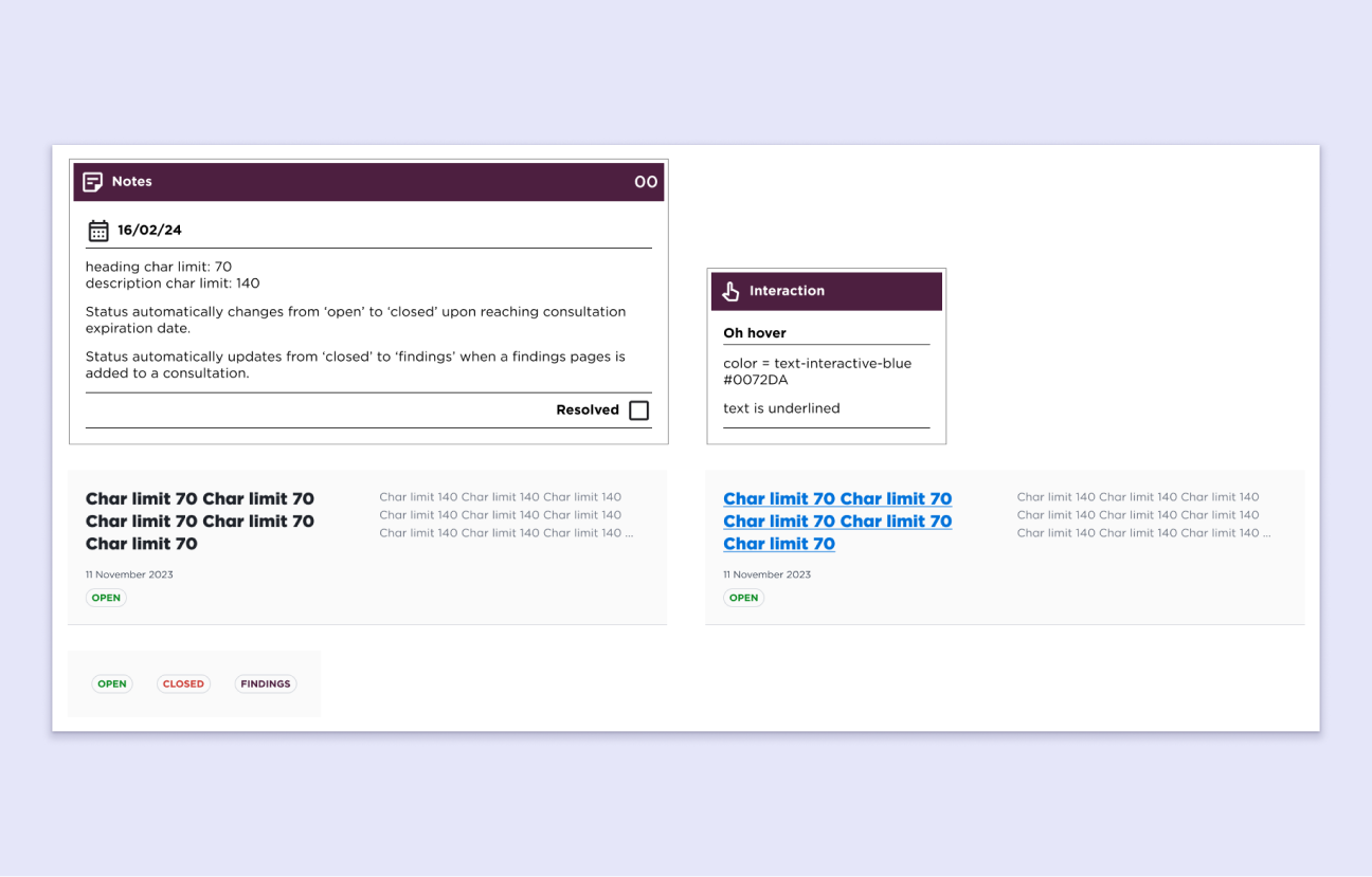
User loaded content - When designing for a CMS, I had to consider the different ways that users might add content. The components needed to be robust and flexible, accounting for title lengths, character limits, different content types, and states.
Changing requirements - The project had many changing requirements and redesigns. It was important to adapt quickly as things evolved. Our team had to track versions, make fast adjustments to deliver on time.
Diverse user base - We had to design for a wide range of users, including teachers, admin staff, parents, students, suppliers, and more. We also needed to consider internal ministry staff who would access the site and manage its content.
CMS content blocks
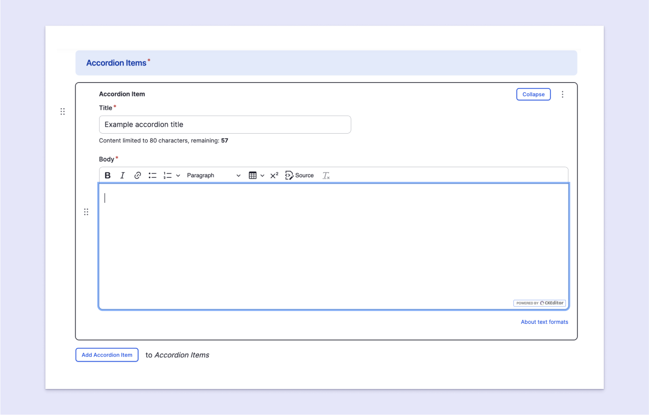
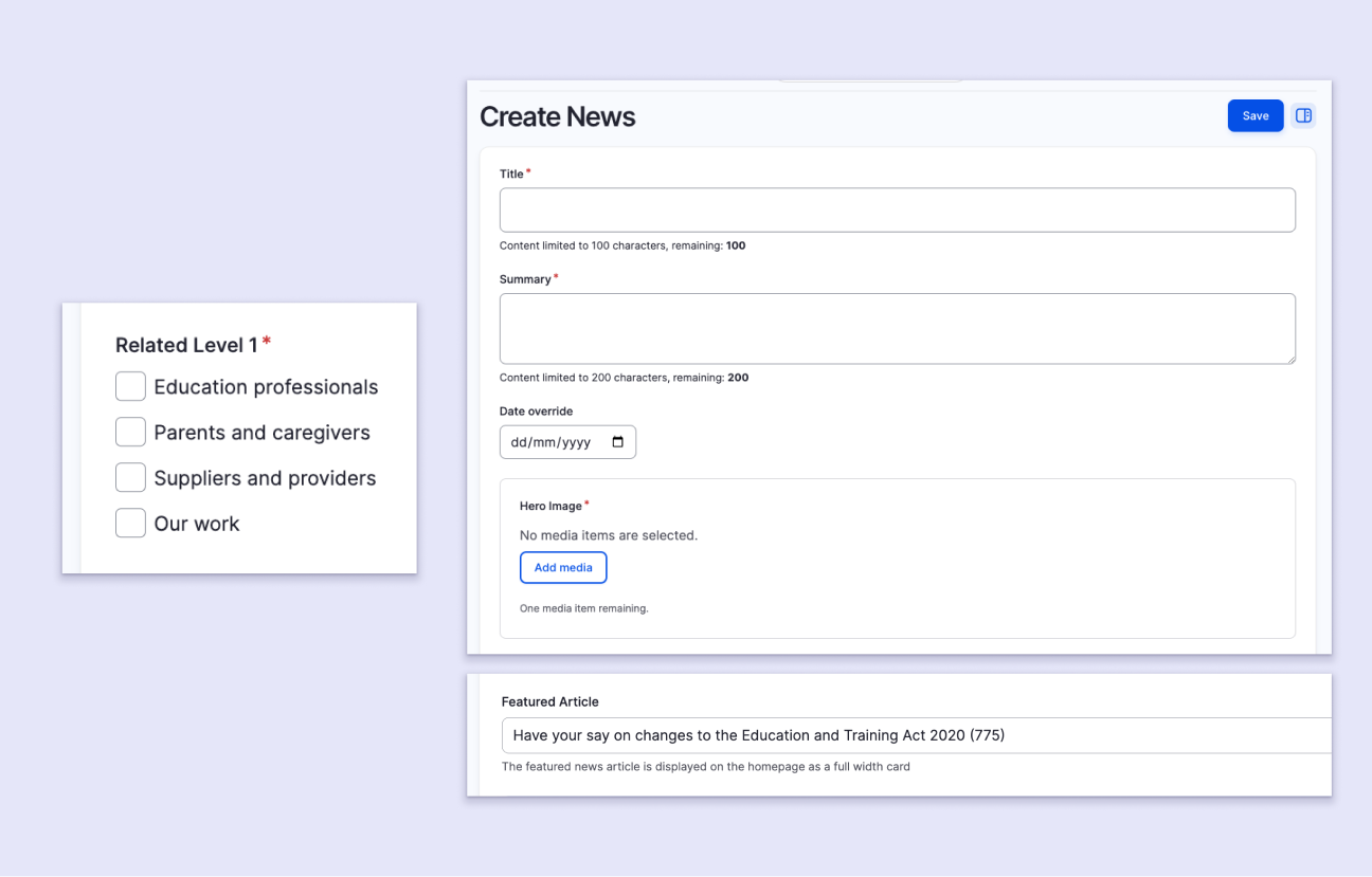
Components are added to Drupal as 'Blocks'. Content loaders can easily add a block through a user-friendly GUI (graphical user interface).
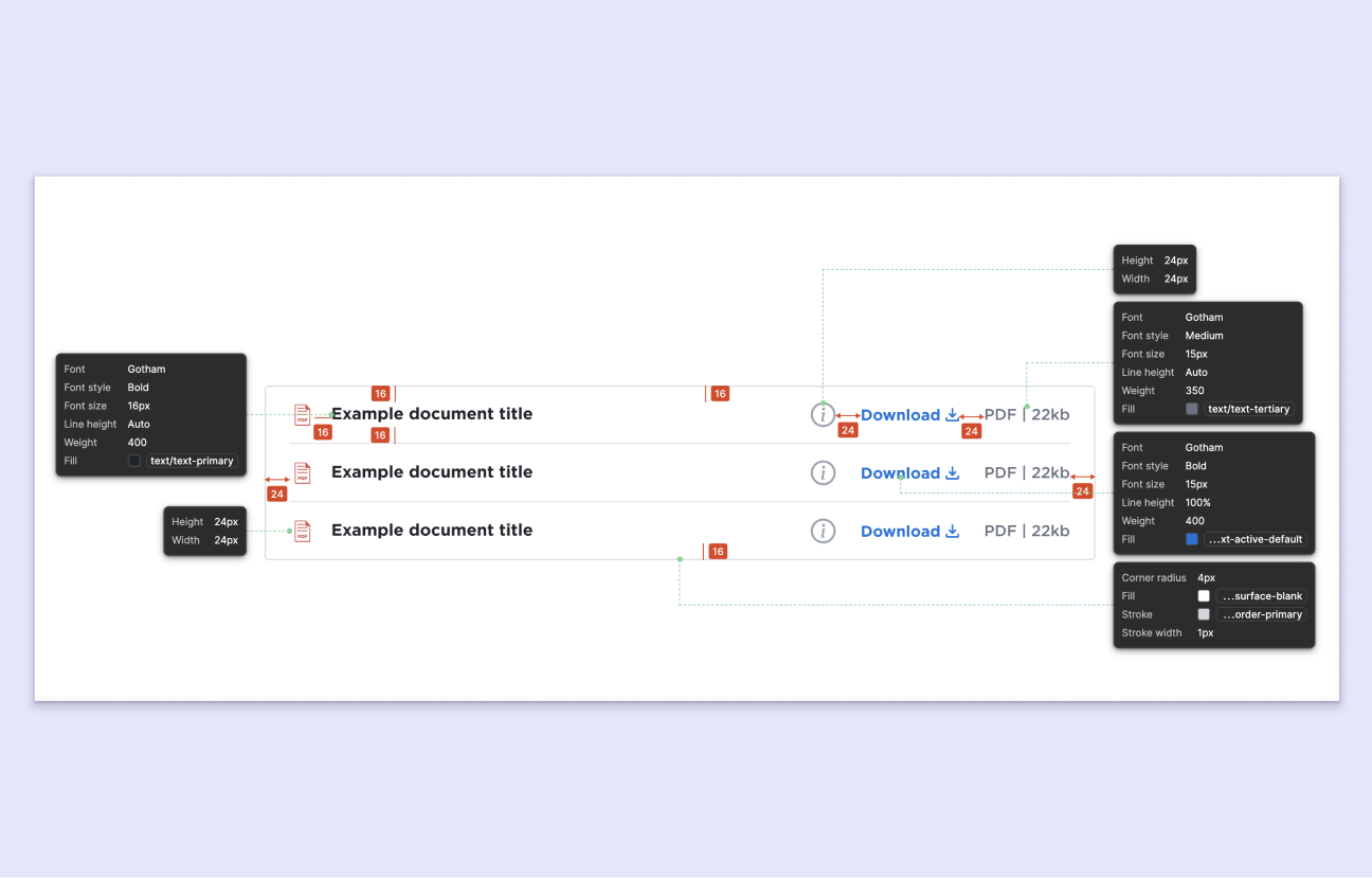
The design process had to account for the various ways a user might add content to a block. We added guard-rails such as character limts or line lengths to ensure content would always appear tidy when rendered on the page.
Building pages
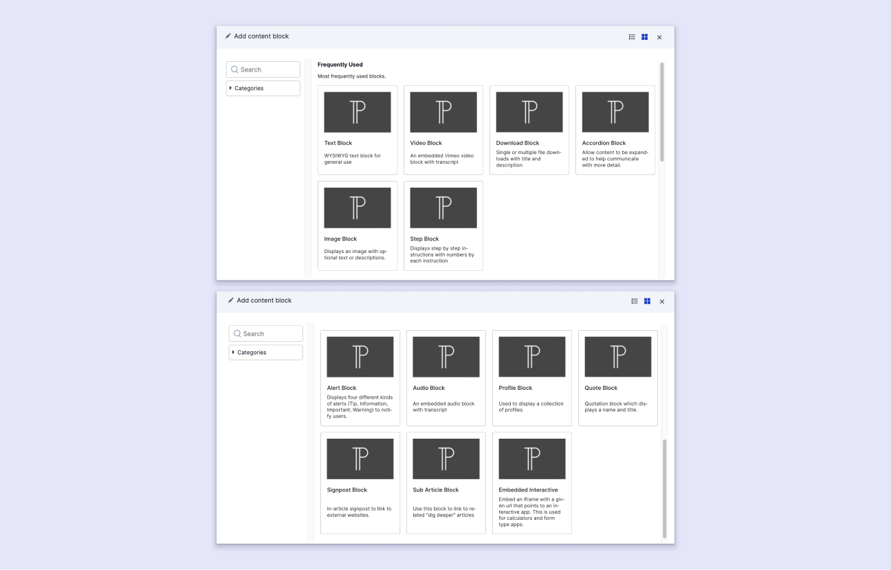
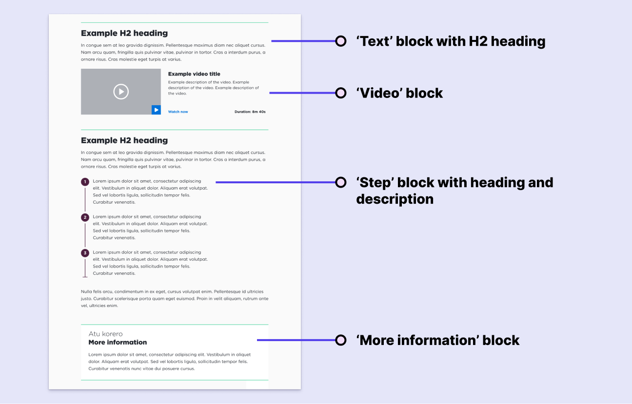
We built a variety of different blocks for content loaders so they had all the tools they needed to build up pages on the site.
We carefully planned how these blocks would work together on a page. The blocks were designed so that users could mix-and-match content, often adding blocks in different configurations.
The designs ensured that content blocks consistently fit together on a page, maintaining spacing, layout, and a clear heirarchy of information.
Audience-specific content
The site featured landing pages and sections for specific audiences (teachers, parents, suppliers, etc.).
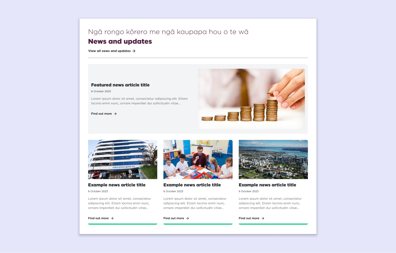
We designed content blocks that could be tagged with an audience or level of importance. For example, content loaders could use the Drupal GUI to tag a news article with 'Parents and Caregivers' and 'Featured article'. This article would automatically appear as the most prominent article on the parents page.
Component properties
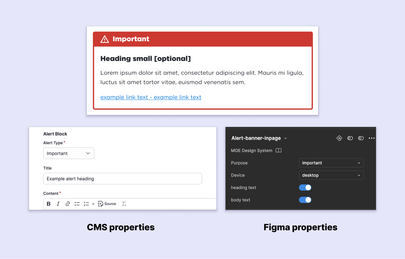
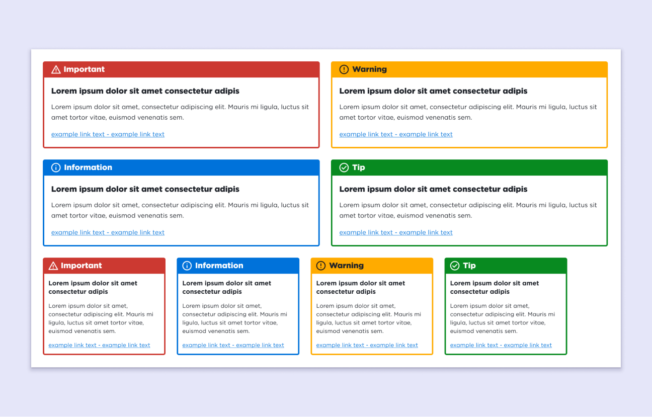
Content blocks were designed with editable properties. This allows users to configure blocks for different purposes. For example, an alert block could be configured to convey different information. Users can add or omit headings or content text, all through easy-to-use GUI controls.
We replicated these properties on the Figma components in our Design system library. This allows us to easily mock-up the different alert block variations in designs and reuse them for future projects.
Handoff and specifications
There needed to be a tight link between the component designs and implementation in the CMS. This meant it was very important to work closely with the developers.
We used Atlassian Jira to create and manage tasks. I provided notes, wireframes, design specs, and often met in person to resolve issues and collaborate.
I used Figma's dev mode to convey specifications such as; colours, spacing, fonts, and other details from our design system. This gave developers a clear and accurate picture, reducing the need for revisions, and often resulting in pixel-perfect results first time.
Summary
Outcomes - As teams started uploading content, we realised many adjustments were needed, and this will likely continue throughout the product’s lifecycle. It’s tough to predict the needs and behaviour of such a diverse group of users and content. The strong, efficient relationship with the developers has made it easier to handle these changes.
What did I learn? - This project taught me a lot about designing a large, content-heavy website on a CMS.
- I had to make key design decisions to ensure our library of components work for different types of content and are adaptable for the future.
- I had to balance the needs of content loaders and end users. This challenged me to be flexible and agile in my design approach.
- I worked closely with web developers, building a strong and cohesive partnership. I gained valuable experience with design handoff and creating clear design specs.
Next steps - The site will keep evolving based on user feedback. As we add more content and sections, new components may be needed.