Overview
This personal project aimed to improve my design skills by creating an effective landing page for a property management company. The goal was to create a page that funnels users toward an action. In this case booking a property appraisal.
To learn more about my target audience, I researched the property industry and interviewed property owners. From my research, I created user personas and other artifacts to generate empathy and uncover users' needs or pain points.
These insights helped shape the page's design, tone, and messaging.
| My role | UX/UI Designer |
|---|---|
| My Tasks |
|
| Tools |
|
Why design a landing page?
Landing pages are a standard, and important part of web design. They are usually the first page a user sees, and the gateway to the rest of a website.
Designing a landing page taught me how to guide users through a page's layout and key elements. I learned how to use these elements to tell a story and lead customers to take action.
The exercise was a practical way to sharpen my skills in empathy, user flows, and effective communication, all essential UX design skills.
UX research
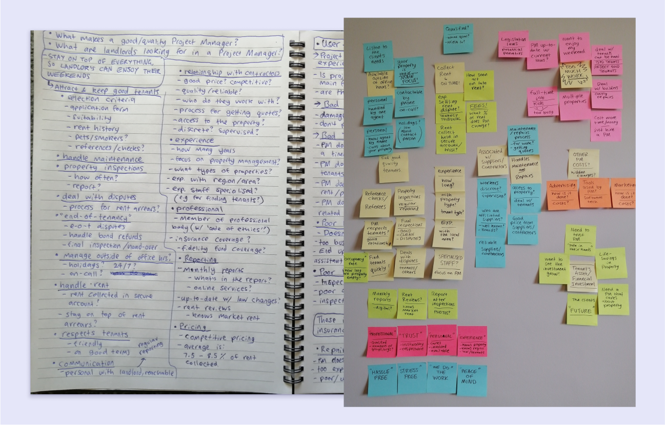
Interviews - I conducted interviews with people I knew that owned homes or rental properties to learn what they would look for in property management and understand their main concerns.
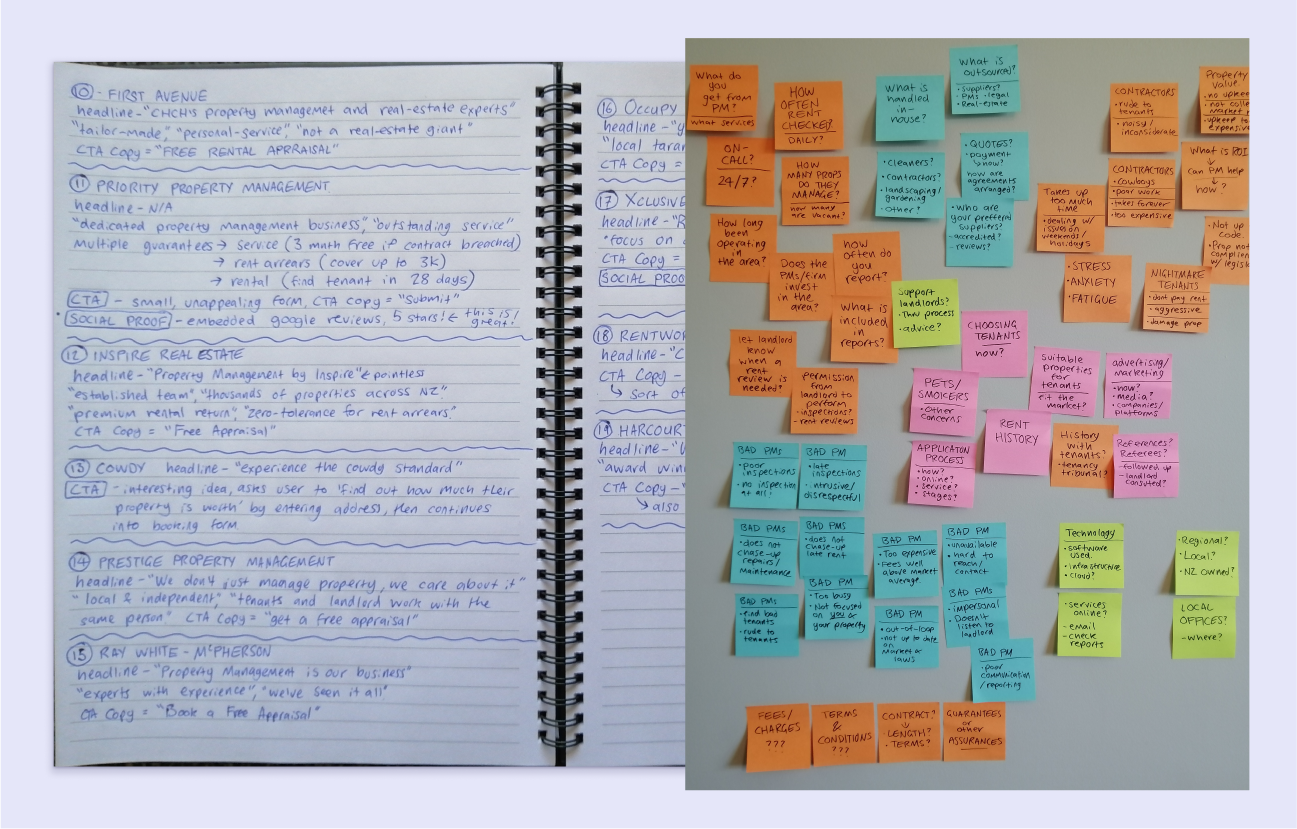
Competitor analysis - I reviewed property management websites in the Canterbury region to identify strengths, weaknesses, and trends. I looked for user experiences that worked, and ways I could make my own designs stand out.
Affinity mapping - Using sticky notes, I organised my research findings into common themes, helping me focus on key insights for the project.
Themes and insights
The main theme from the interviews and research was that property managers should minimise hassle for clients, handling as much of the work as possible. This became my focus and 'unique selling point' (USP) for the page. Some other common themes and insights included:
- Fees/value for money - The average management fee was between 5-8%. Users also wanted to know what services were provided for this price, and if marketing and advertising was extra.
- Communication - It is important to property owners that they're kept in the loop. They wanted regular reports, inspections, and information on changes in the market.
- Tenancy issues - Managers should regularly deal directly with tenants and handle any problems that may arise.
- Maintenance and repairs - managers should be able to facilitate this for the client. It's a bonus if the company is associated with a contractor or suppliers they can trust.
- Experience and professionalism - Property managers should understand the local market. be qualified, certified, and have a proven track record.
- Availability - The property managers should be accessible, listen to the client's needs and be available in an emergency.
Building empathy
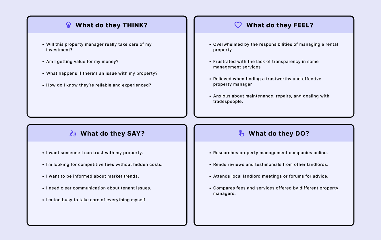
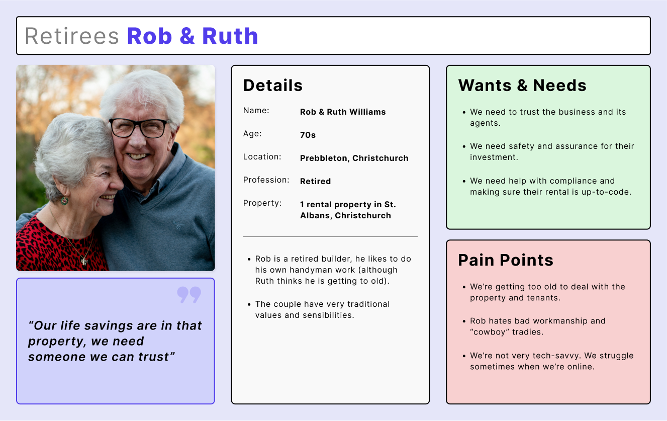
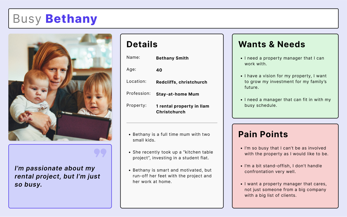
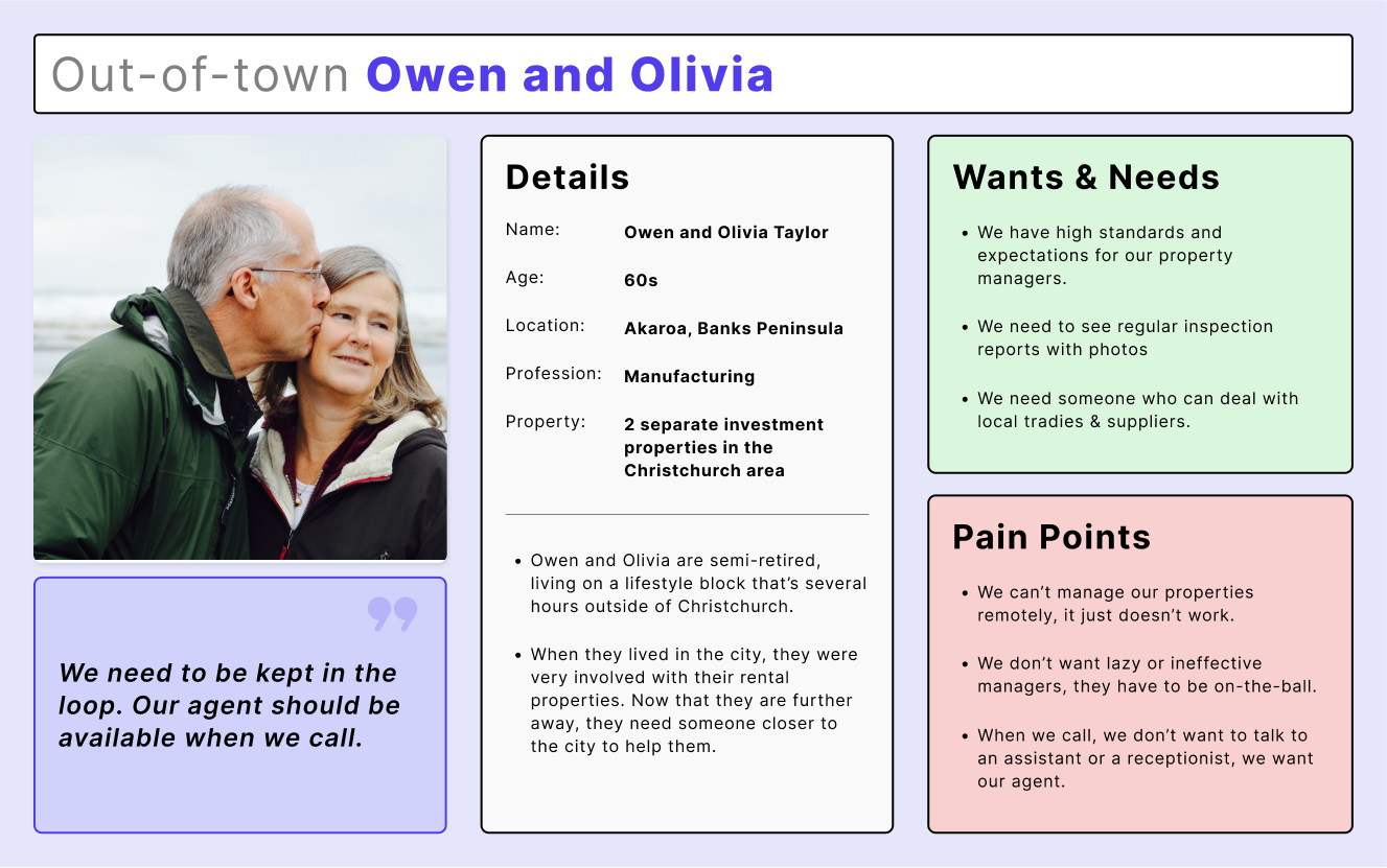
I used the insights from my research to create personas representing the site's audience. These personas include details like age, gender, location, goals, needs, challenges, and preferences.
The personas turned my research into relatable human beings. This allowed me to design for a person that I can understand and empathise with.
Style and voice
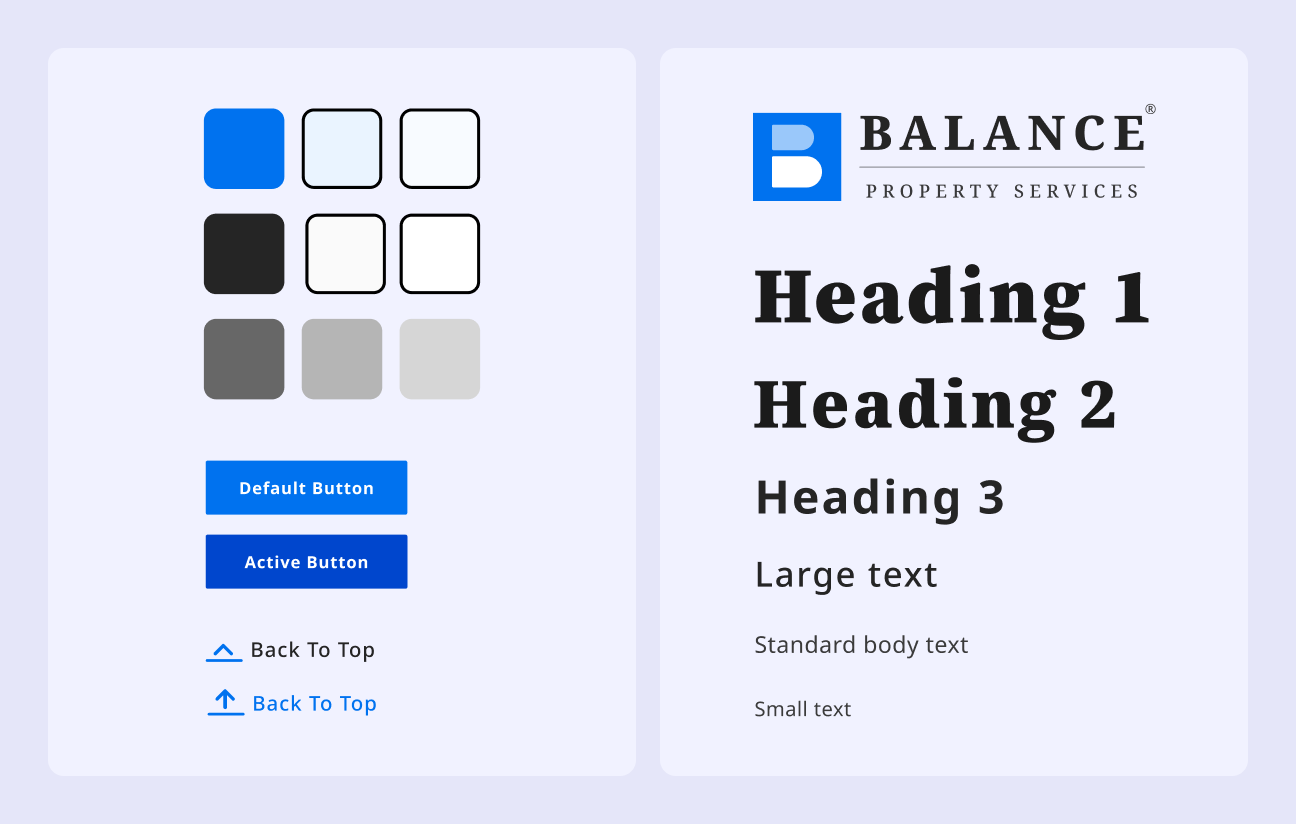
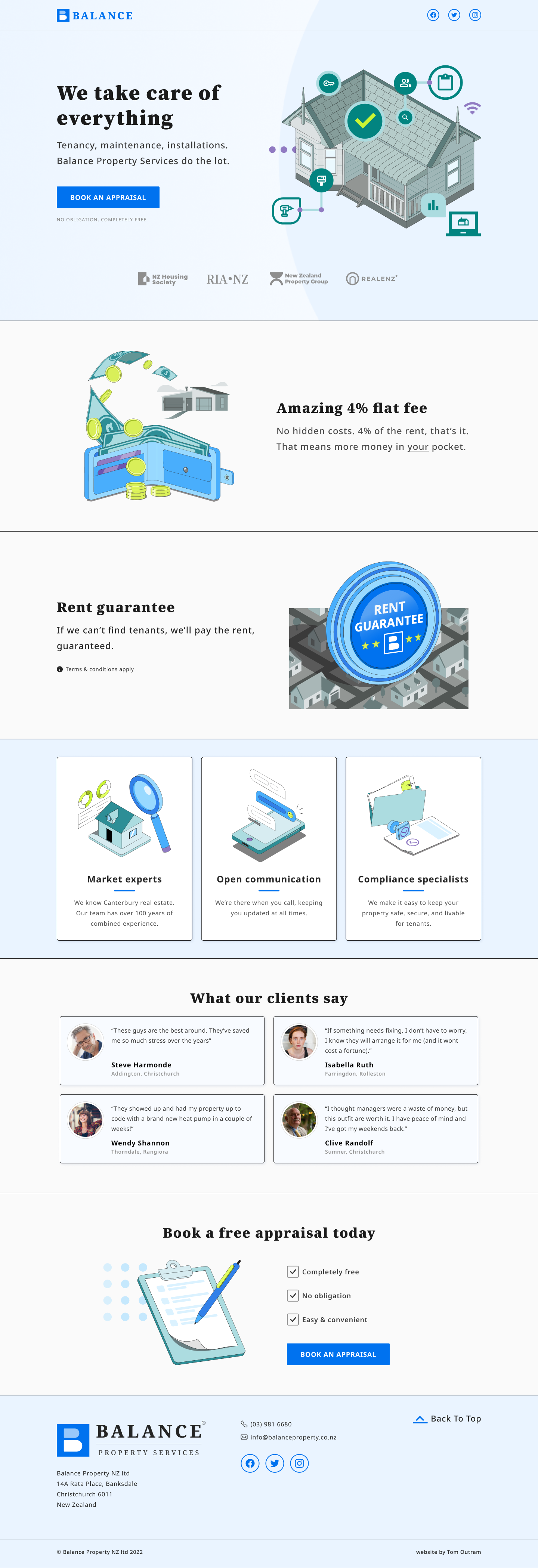
I chose blue as the primary colour for the site. For the typography, I picked a serif typeface for its clarity, visual weight, and authority. Both the colours and type were picked to reflect a sense of trust and reliability.
I made the website's copy approachable by using inclusive language like "we" and "you," with a helpful, solution-focused tone. I kept sentences short and punchy, addressing key customer concerns from my research.
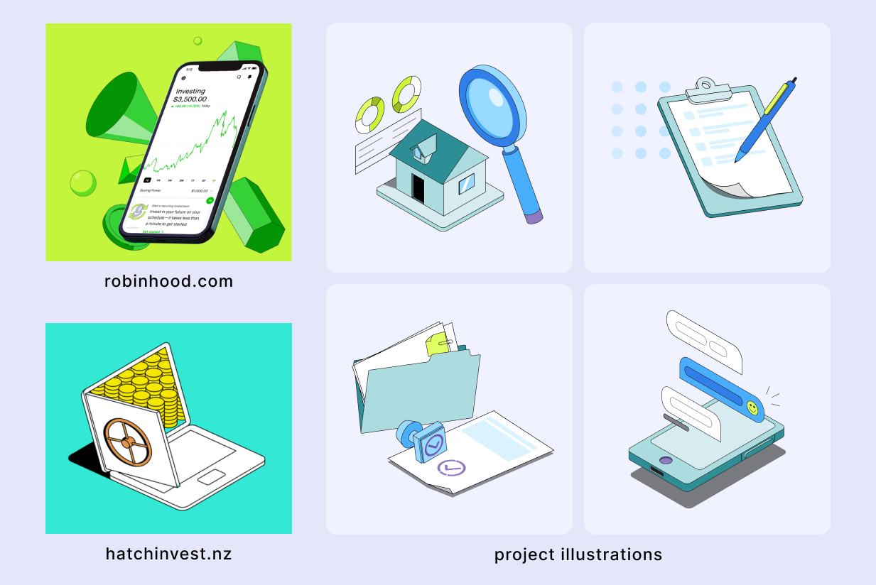
For the illustrations, I chose an isometric style, common on banking and investment sites. This style has a modern sensibility and helps to visually communicate how the product can solve user issues.
Landing page structure
Informed by my research of landing pages at the start of the project, I began creating the various sections and components of the page. These included:
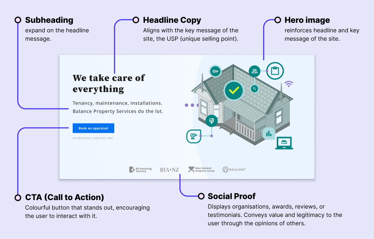
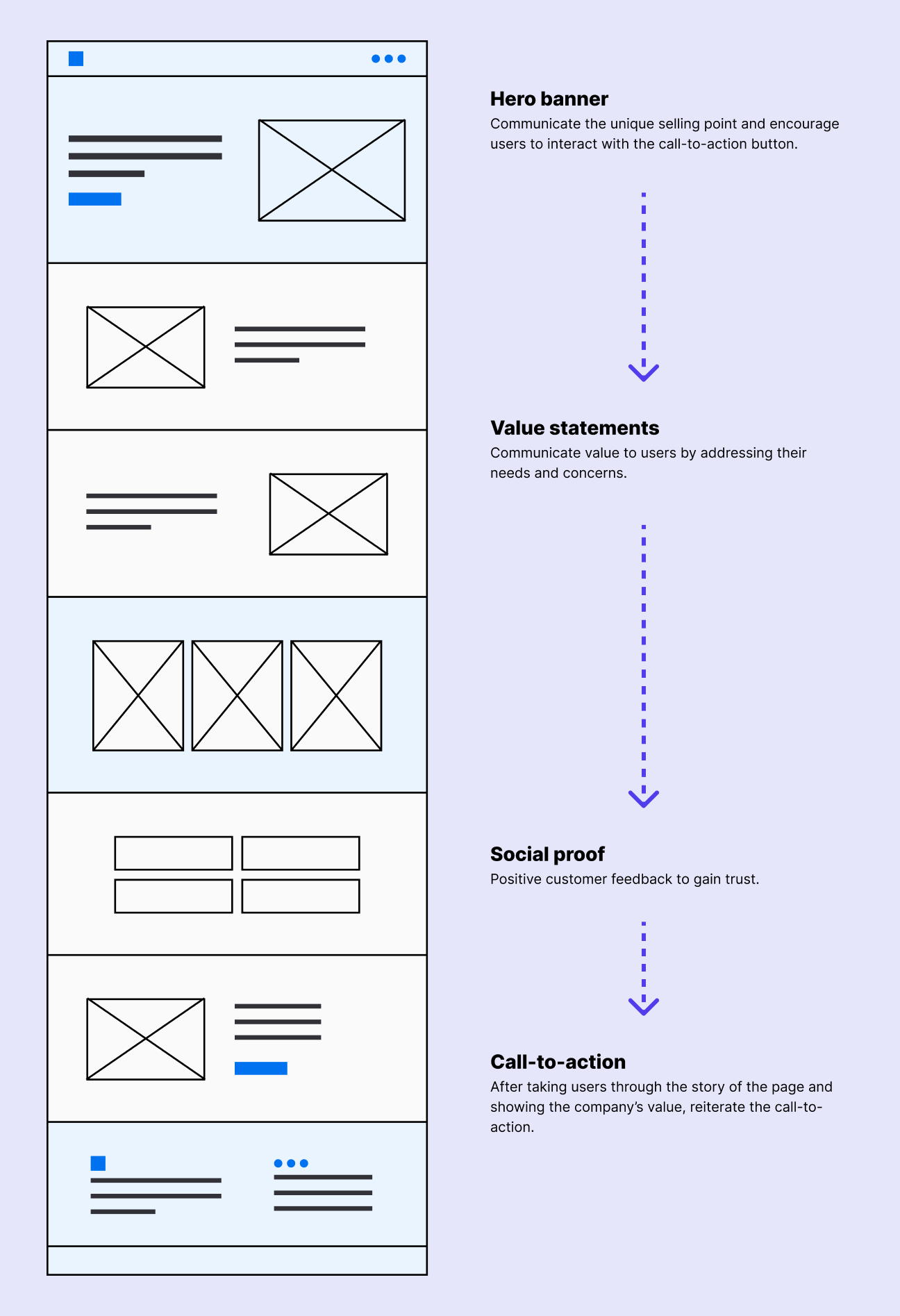
- Hero banner - The main feature of the banner is the headline and subheading texts which convey the USP (unique selling point) to users. Below that is a prominent CTA button encouraging users to book an appraisal. A hero illustration draws the user's eye to this section and further supports the message.
- Value statement/communication - The middle parts of the layout are focused on advertising the features and benefits of the product. These sections also address user concerns or objections as they read down the page.
- Social proof- I have included some fictional real-estate organisations that the company could belong to, along with positive customer testimonials. This social proof helps build trust with users. It reassures them of the product's authenticity.
- CTA- I added a bold, colourful CTA (call to action) button in the hero banner to encourage users to engage with the product. As they scroll, they're funnelled through a story that showcases features, benefits, and addresses concerns. At the end of this story, another prominent CTA button invites them to take action.
Final designs
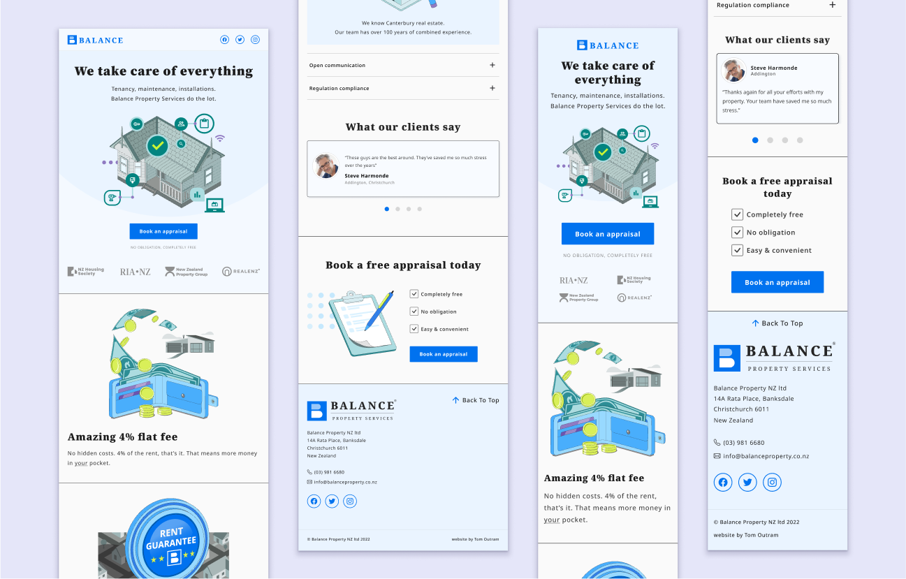
The final designs bring everything together, reflecting user research in both the visuals and messaging. I created tablet and mobile versions to ensure a consistent user experience across all devices.
Summary
What did I learn? - I gained a deeper understanding of landing pages and how they are structured to convert customers. I practically applied ux research to a design, utilising user insights to inform my design decisions and communication.