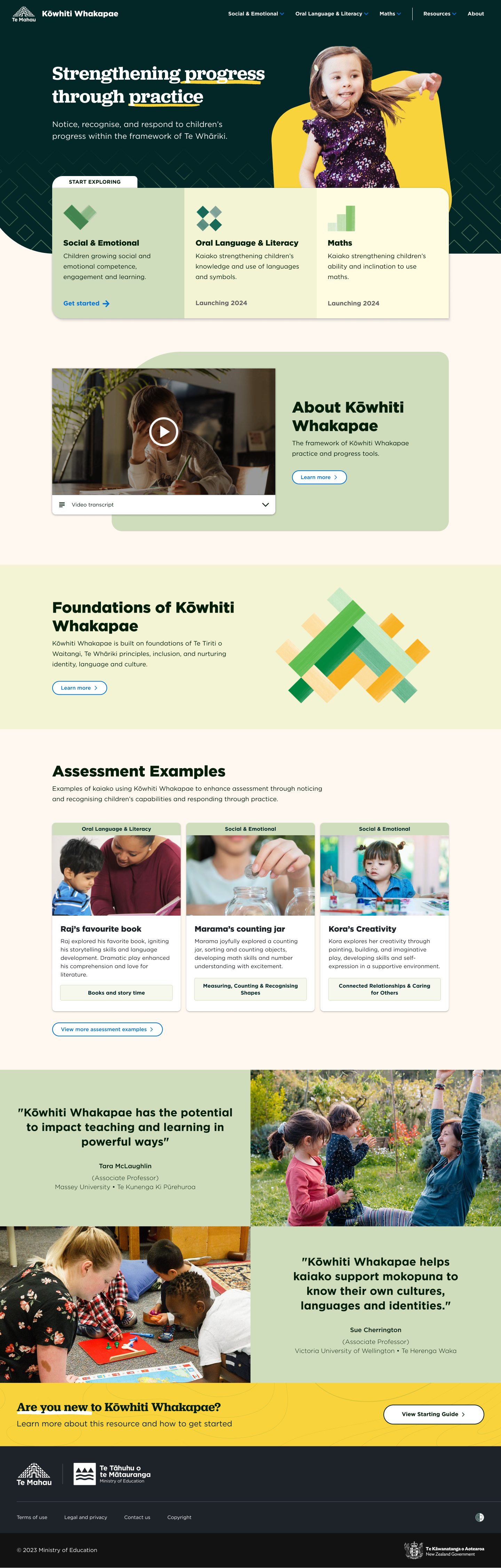
Overview
Kōwhiti Whakapae is a Ministry of Education website. It offers tools to help early childhood educators upskill with new concepts and practices.
My team worked closely with a group of subject matter experts (SMEs) from early childhood education. Our goal was to translate their vision for these tools from paper-based PDF documents, into an effective online product.
| My role | UX/UI Designer - assisting the senior designer on this project. |
|---|---|
| My Tasks |
|
| Tools |
|
Challenges
Adapting tools for the web - We had to translate multiple booklets of complex educational tools and material into a usable online tool.
Verbose and dense text - Large blocks of text had to be included in the site, often with specialist terms or jargon which could be intimidating for users.
Client new to web design - The client was struggling to define how the tool should work online. We needed to be patient and collaborate with them to realise their vision.
Discovery and definition
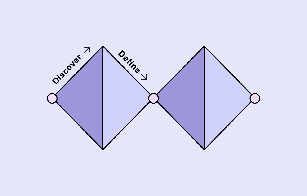
The 'double diamond' visual framework is a good way to describe how my team approached this project.
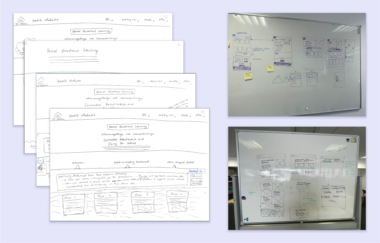
The first part of the project was about exploring and understanding the problem. In the Double Diamond method, this is called 'Discover' and 'Define.' We collaborated with the client on rough wireframes and sketches to better understand their goals. This helped define some of the key problems to solve:
- Settling on the terminology for the tools and practices.
- Defining the flow and structure of the tool.
- Simplifying complex concepts or jargon.
- Visually defining sections of the tool.
- Creating effective information architecture and navigation.
Development
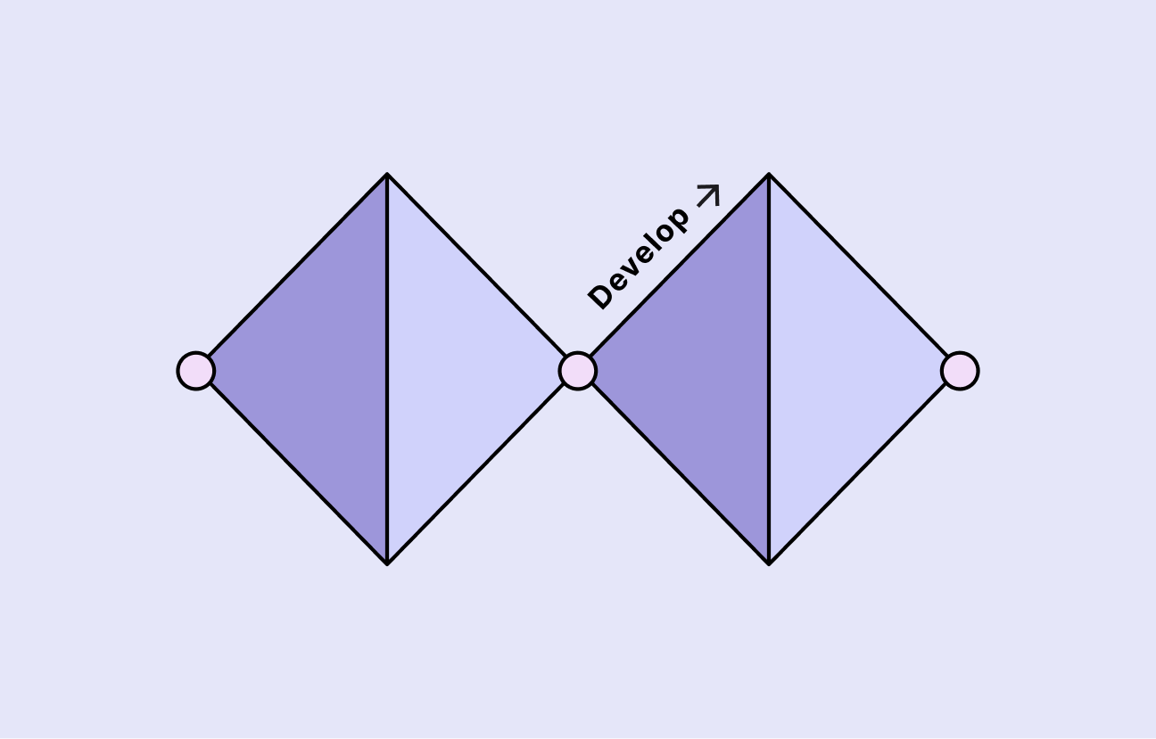
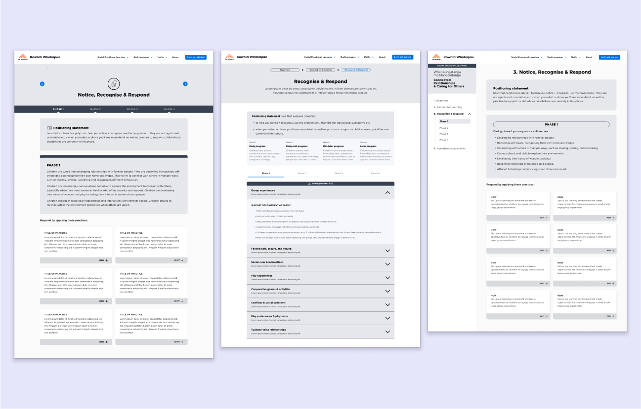

Our next steps involved developing solutions to the problems we had defined. In this 'Develop' stage, we iterated over multiple options, tweaking and improving the designs.
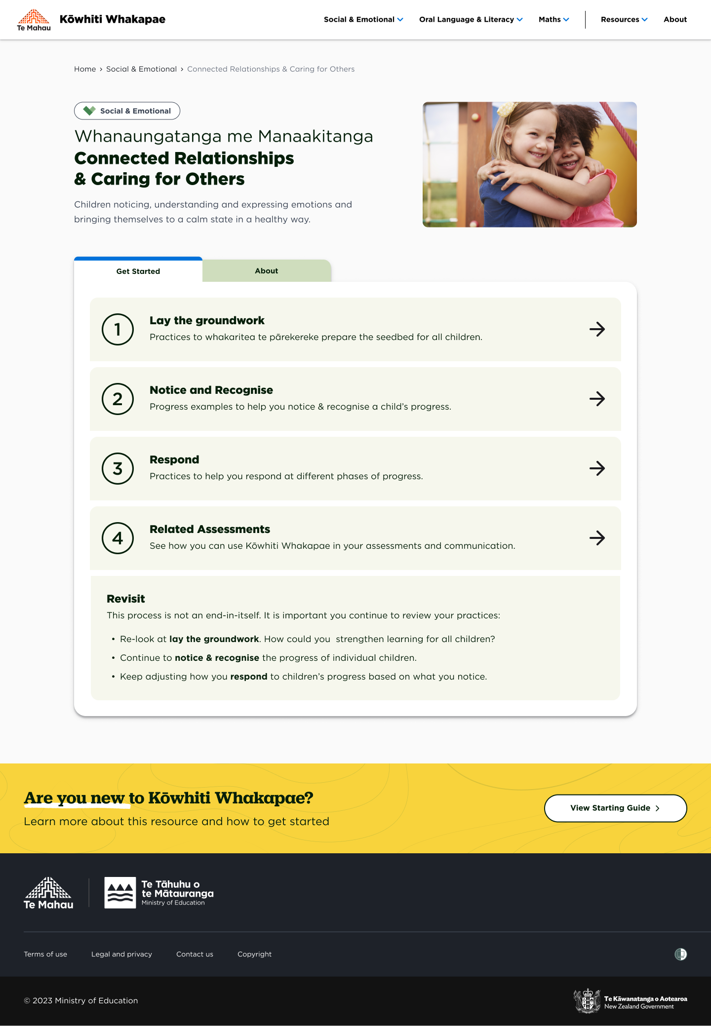
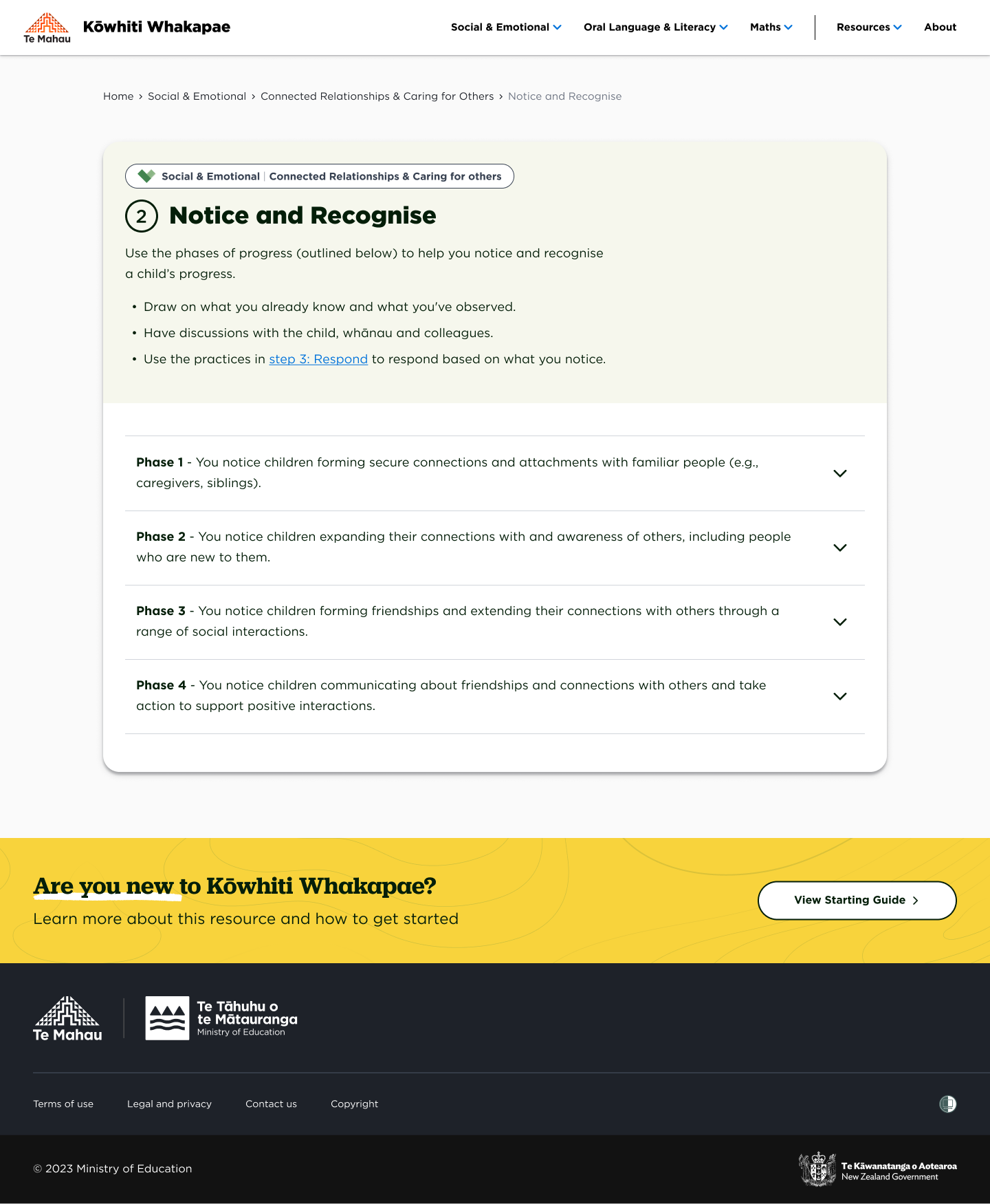
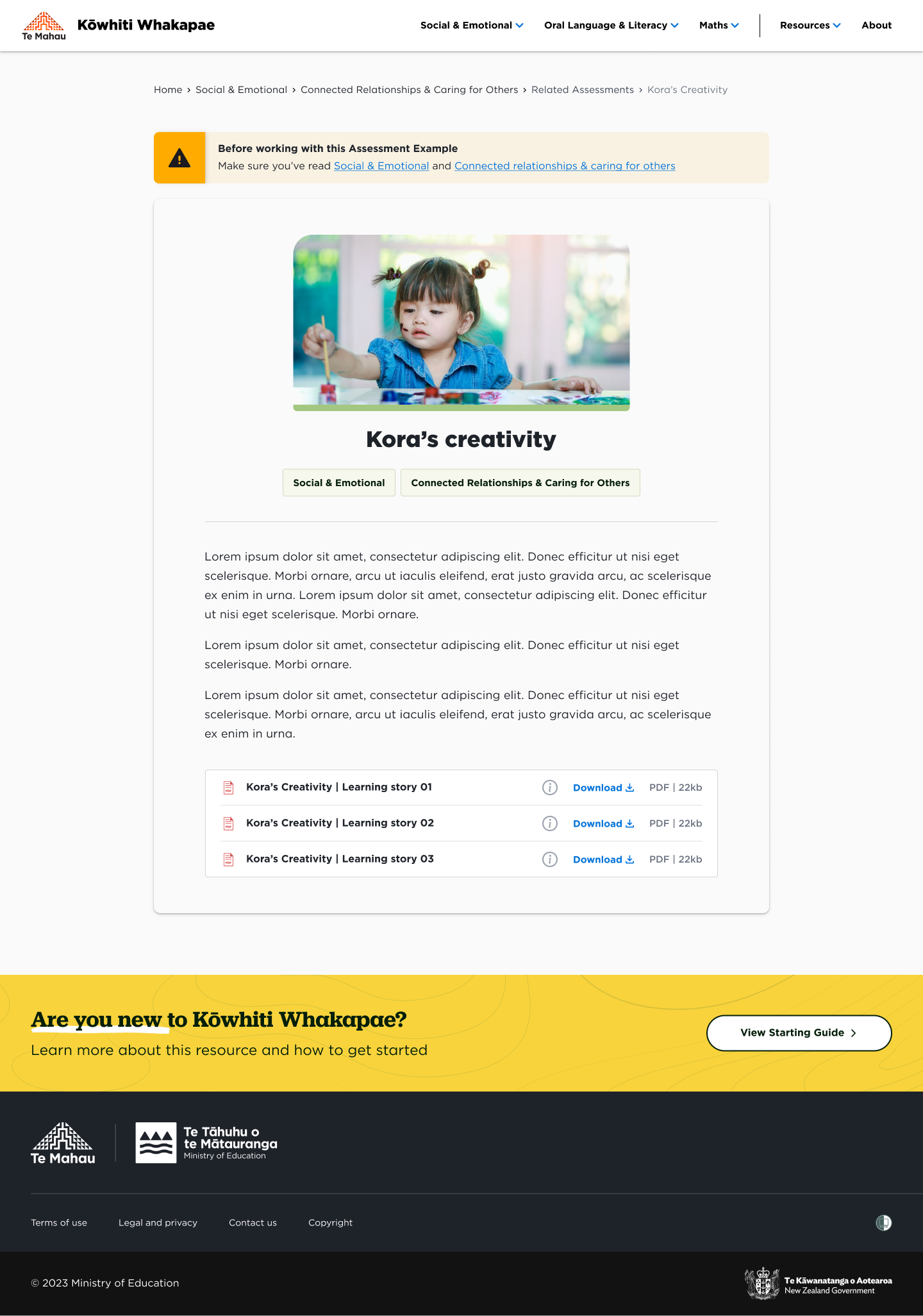
We separated the different stages of the tool into clearly defined sections. We wanted to create a flow that intuitively guided users through the process.
Simultaneously, we worked on making the designs responsive for different devices. The flow of the tool needed to be easy to use on any screen size.
Prototyping
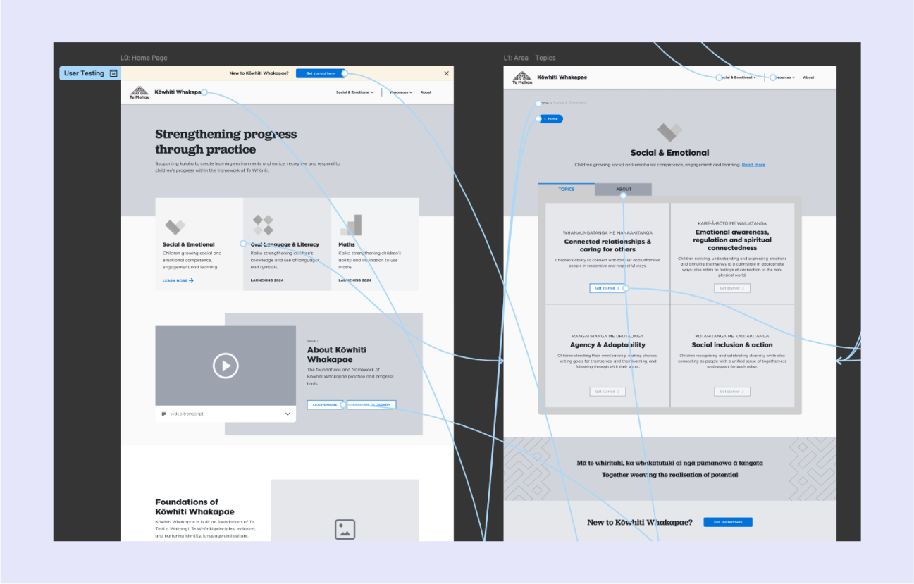
Based on the wireframes and design decisions, I created an interactive prototype in Figma. The goal was to test the designs with users to validate our solutions. Lo-fi prototyping like this has several advantages:
- We can test the user experience early, before spending time on high-fidelity designs.
- We can check if users are able to easily navigate the product.
- It simulates real user interactions, helping us spot user issues.
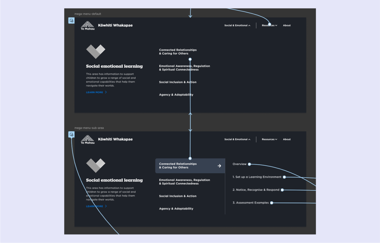
- We can test complex UI elements like the mega menu.
- It was quick and easy to update the prototype after each test, allowing us to try different solutions with users.
User testing
Testing plan - Using the interactive prototype, we conducted usability testing with educators from across the sector. Our testing plan included:
- Purpose and goals
- Tasks for users to perform
- A script of questions we loosely followed
- A timeline to track progress during the session
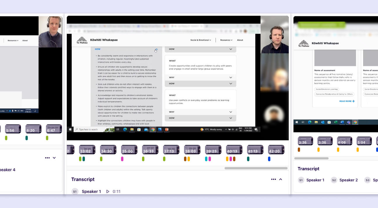
Testing sessions - Each session lasted one hour. Users performed simple tasks across different parts of the product. We observed their behaviour and asked them questions to check their understanding.
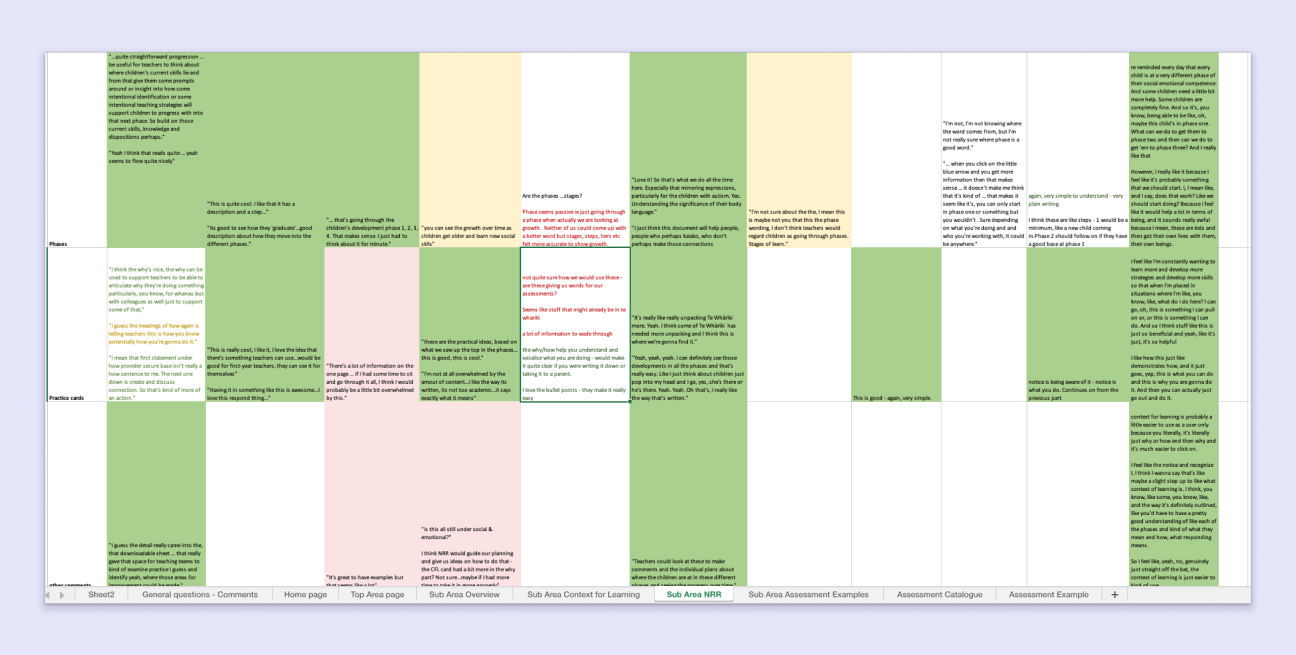
Sessions were recorded, we used Dovetail to transcribe and identify common themes. Findings were organised in a spreadsheet to hone-in on key issues and pain points.
Delivery
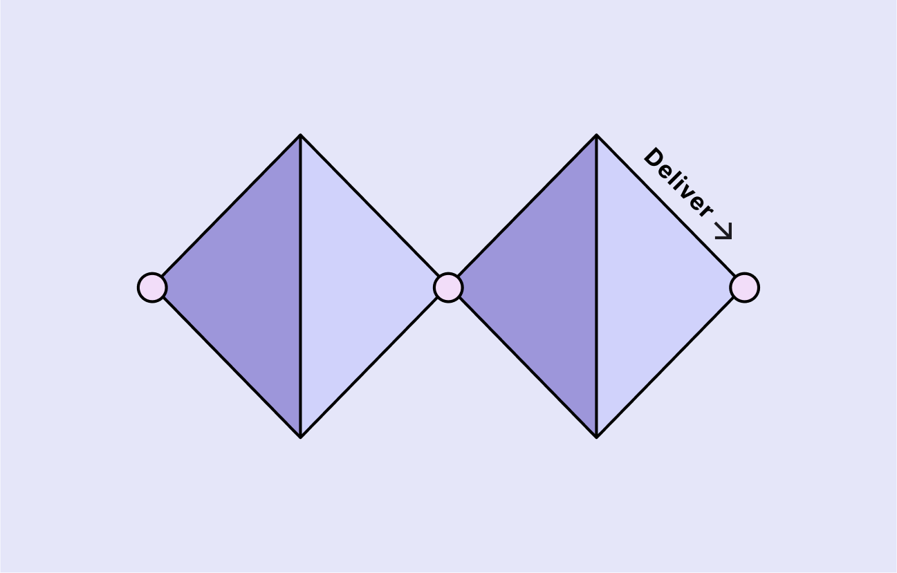
We consolidated the findings and insights from the user testing into a report for the clients. After consulting on any recommended changes, we were ready to create a set of final designs and move into the delivery stage of the project.
Usability report
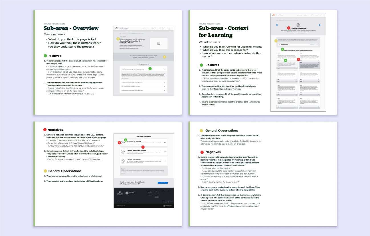
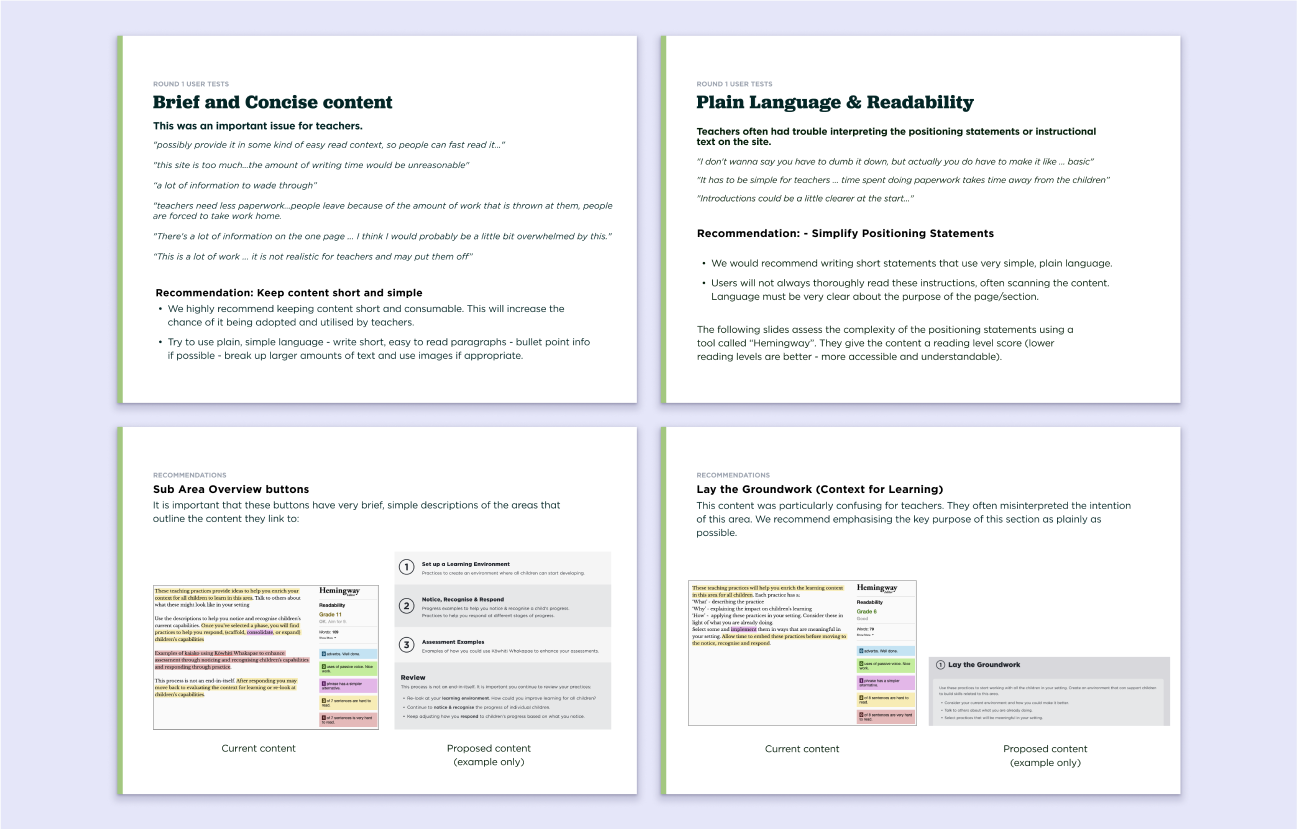
The usability report highlighted the strengths and weaknesses of the product, using visual examples and user feedback to show what worked and what needed improvement.
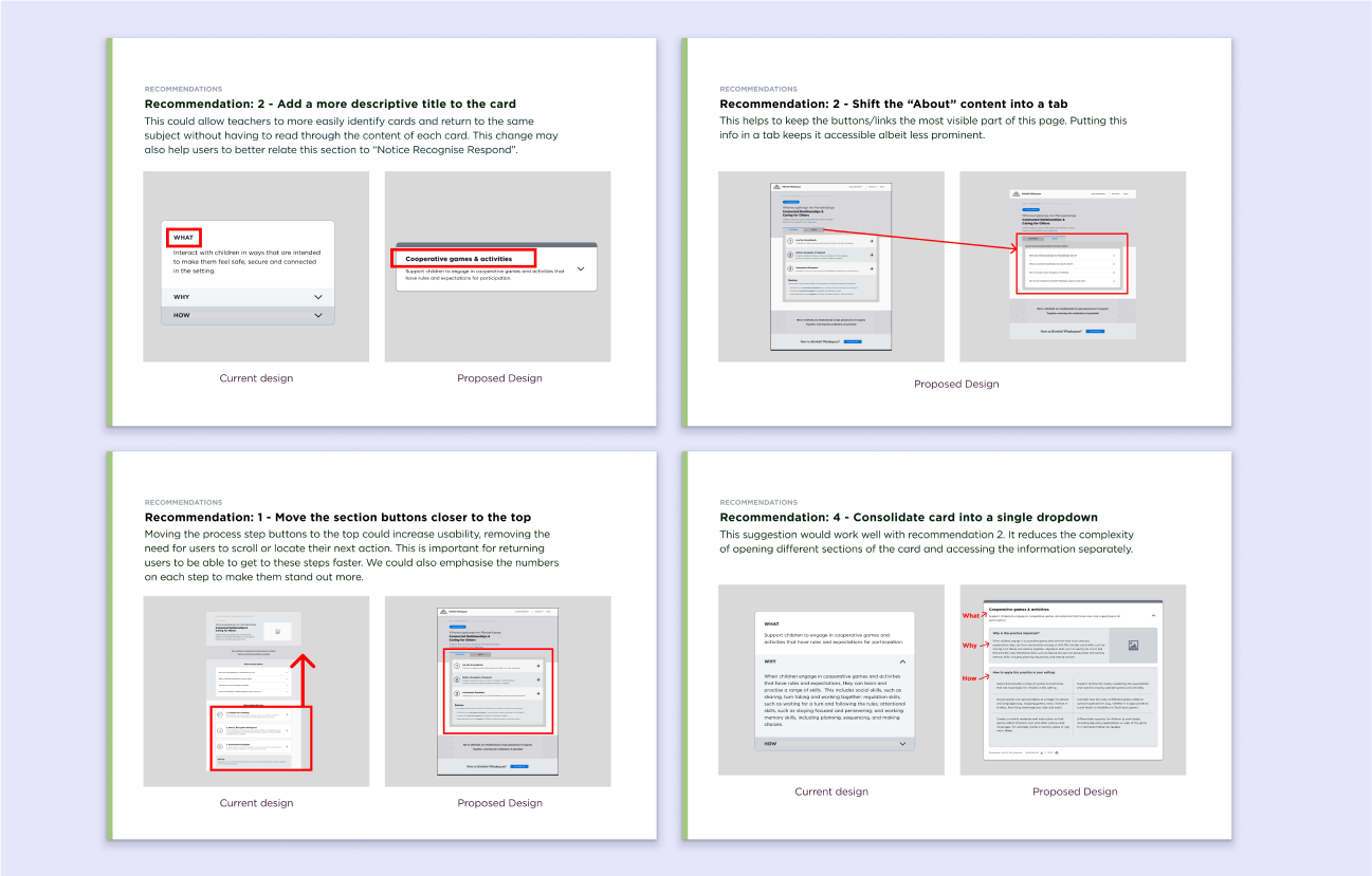
We also included suggestions for design changes to address the issues raised by users or identified in our analysis.
Finalising designs
The final step was to deliver high-fidelity designs and specs to the developers. This included responsive designs for tablet and mobile, as well as specifications for interactive elements, hover states, and other design features.
Summary
What did I learn? - Getting to a final design can take a lot of iteration. Wireframes and low-fi prototypes can be great tools for testing. Communicating ideas through basic wireframes was an invaluable part of this process.
Professional experience - This project allowed me to gain experience across the whole design process from start-to-finish. I was able to:
- Research and iterate over designs.
- Create interactive prototypes including complex menus and UI elements.
- Develop a guide for user testing, facilitate testing sessions, and create a testing report.
- Collaborate with a variety of professionals including stakeholders, business analysts, designers, and developers.