Overview
The central website for the Ministry of Education is education.govt.nz. The site recently underwent a refresh, with a content overhaul and visual redesign.
I worked as a UX/UI designer on this project. One of my key tasks was to design the user interface for the site's global search which was built using Algolia.
This required clear, readable search results and easy to use filtering options.
| My role | UX/UI Designer |
|---|---|
| My Tasks |
|
| Tools |
|
Challenges
Categories and tagging - The site's taxonomy included many different variables such as; audiences, page types, document types, media types, and more. It was difficult to keep everything tidy and understandable for users.
Technical limitations - My designs had to work within the constraints of Algolia's out-of-the-box features. I worked closely with the developers to make sure what I designed was feasilbe and realistic.
Limited site content - The development of the search functionality didn't align with the content re-writing. It was hard to test a site search with limited content to search for.
Information architecture
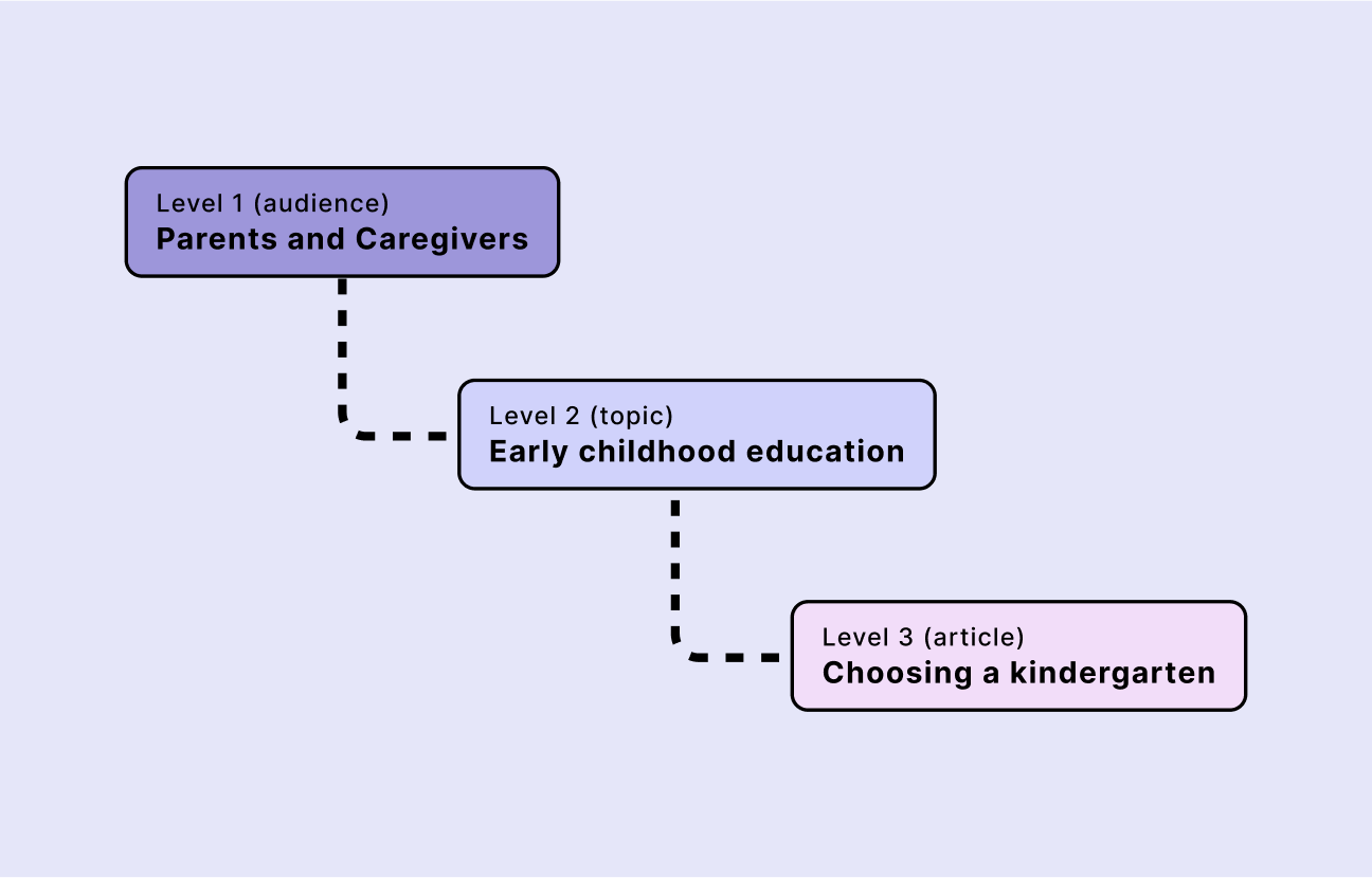
The new site structure organises content around different audience types. Content is tagged with an audience and automatically placed in the right area. The site has three levels:
- Level 1. Audience - e.g. 'Parents and caregivers'
- Level 2. Sub-group - e.g. 'Early childhood education'
- Level 3. Topic - e.g. 'Choosing a kindergarten'
My goal for the search UI was to make it clear where each page fits within this structure, helping users easily find relevant content.
Taxonomy & tagging
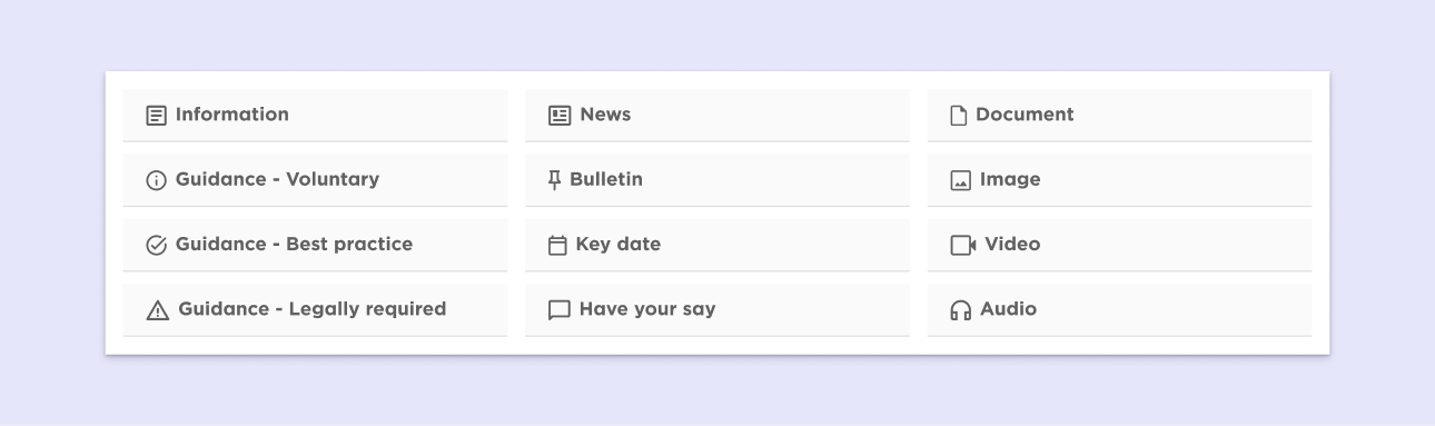
Along with audience types, we had to turn other parts of the site's taxonomy into searchable terms. These included different page types with unique purposes or levels of importance.
Content loaders would choose a content type when creating a page, making it searchable and filterable.
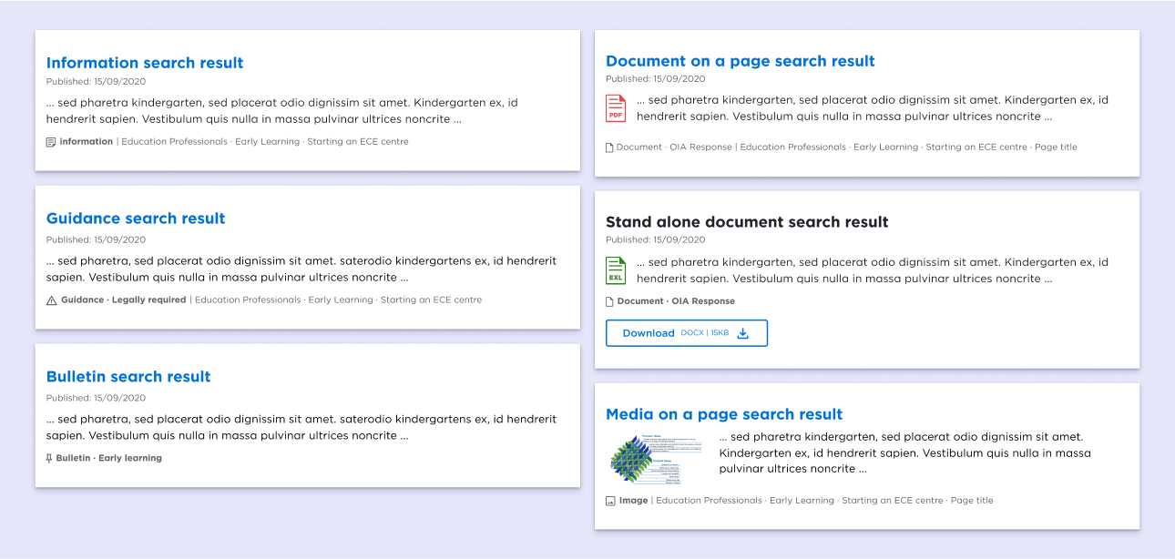
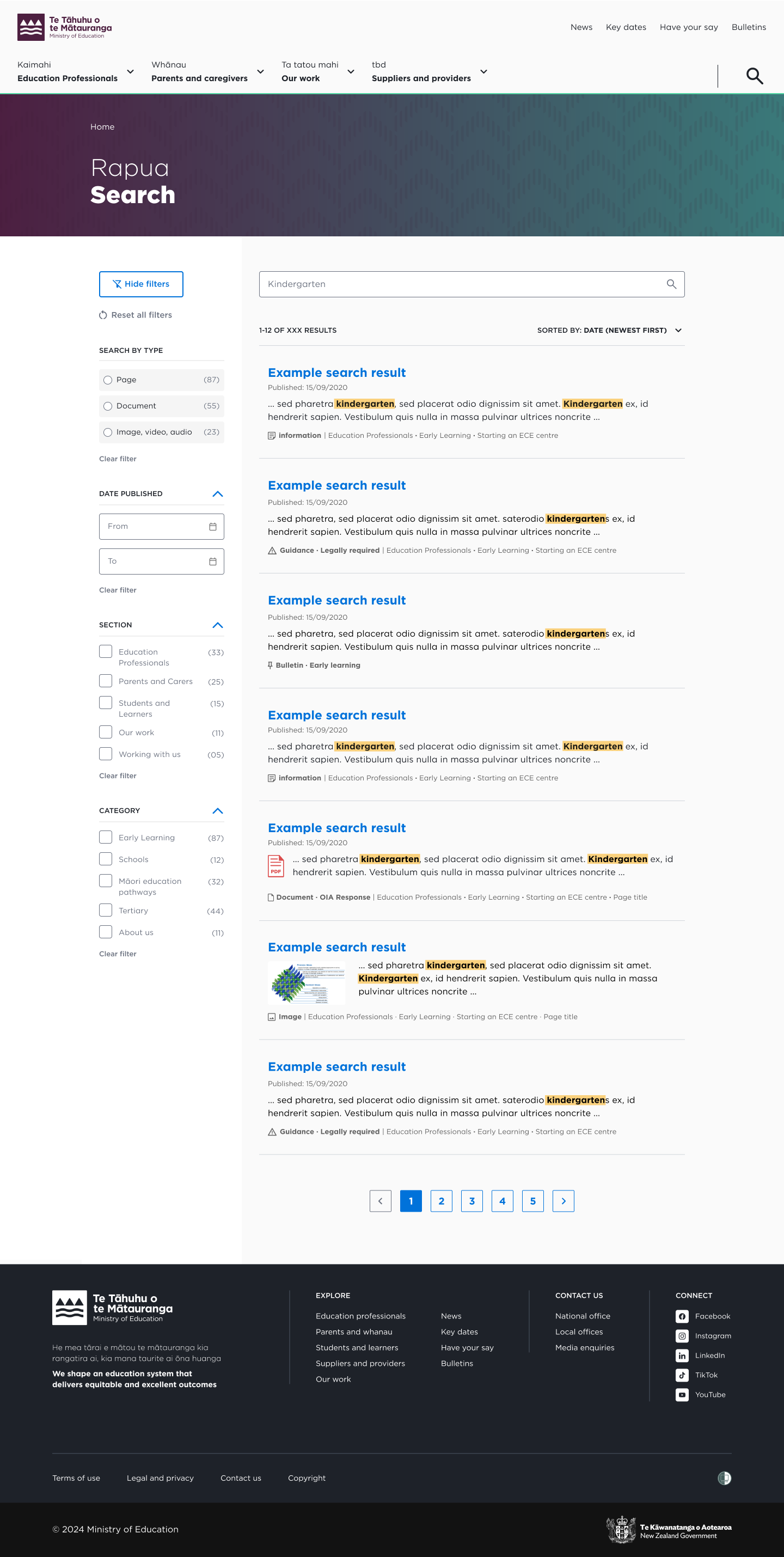
I wanted to make sure the tags were clear and readable. Users should be able to scan a list of search results and quickly recognise each page type. The searchable tags included:
- Page type - Pages such as; general information, news, key dates, or consultations and surveys.
- Compliance type - Some of the site contains guidance that educators must comply with. Other content is only recommended or simply general information.
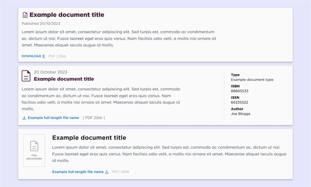
- Media type - This includes media featured on the site such as; PDF documents, diagrams, graphs, videos, or audio files.
Design iterations
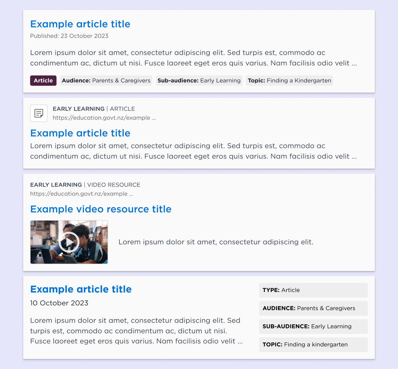
We went through several design iterations to find a clear balance of information. We wanted to provide enough context without overwhelming users. Key considerations included:
- Scannability - I made the titles the most prominent element of the component so users could visually bounce between them as they scanned the results. I used thumbnails and icons to help make the document and media results visually distinct.
- Meta data - I iterated over different variations to create a balance between the amount of info displayed and the readability of the components. I didn't want to overwhelm users with details.
- Interaction - Users should intuitively know where to click to select a result. I used our design system's 'interactive blue' for headings and downloads with a colour change and underline on-hover to indicate interactivity.
- Navigation - I included a breadcrumb pathway to help users understand the location of the page in relation to parent pages in the site's hierarchy of information.
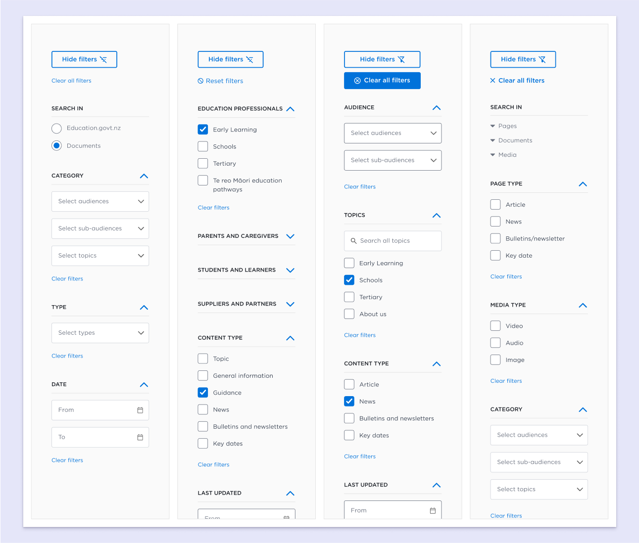
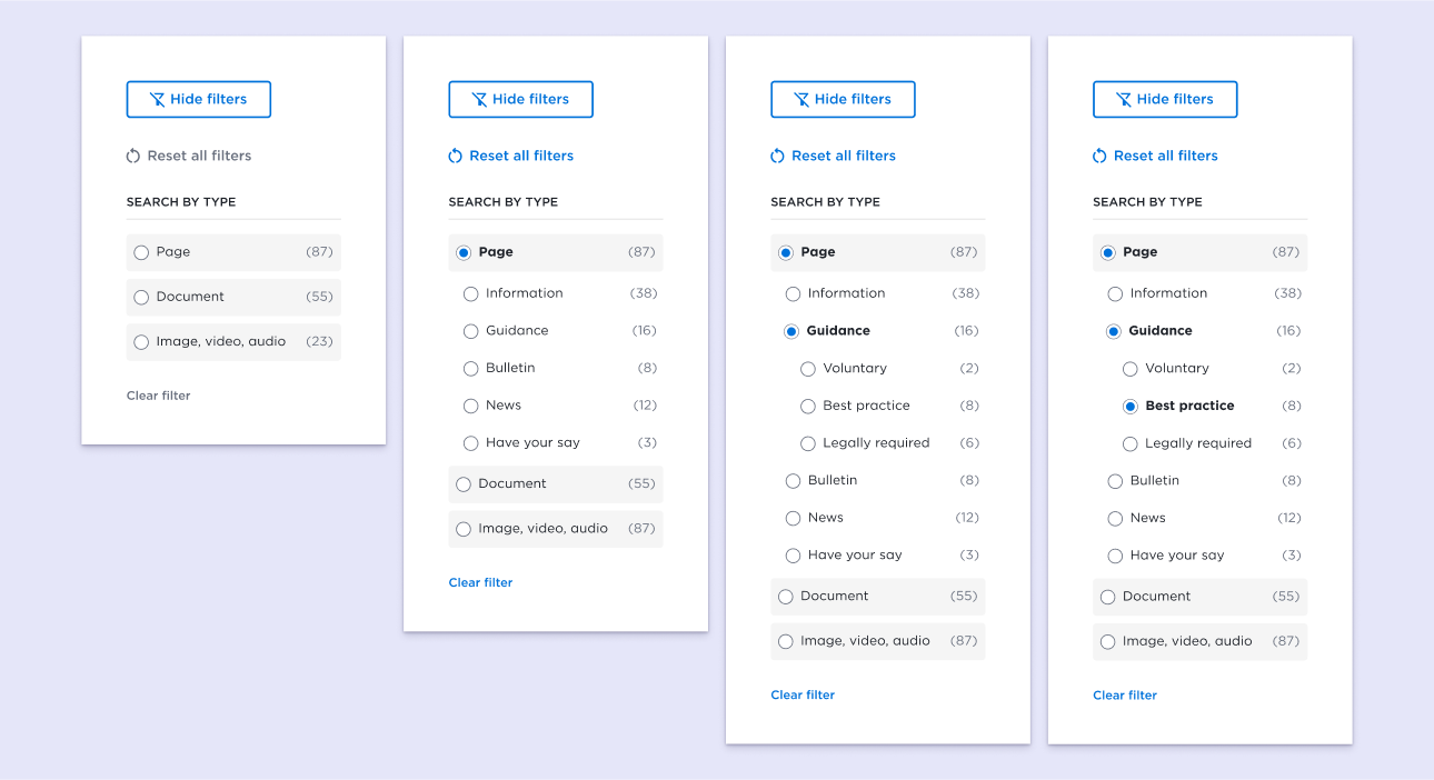
- Filtering - I experimented with dropdowns and checkboxes to find the best fit. I also wanted to be future-proof for new content types that may be added later.
User testing
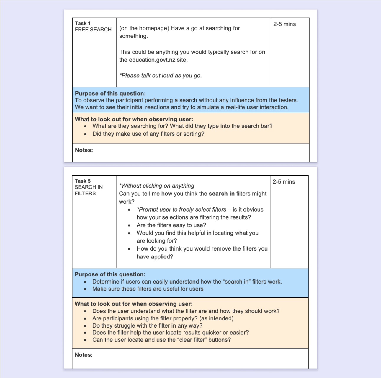
We ran several rounds of testing with users. Initially, I used hi-fi mockups of the search and filters to gather feedback. Based on user input, we made changes like simplifying tags, renaming items, and rearranging the order of the filters.
Our developers implemented the search designs into a UAT build for more in-depth testing. We prompted users to perform simple search-related tasks to observe their interactions with the search UI.
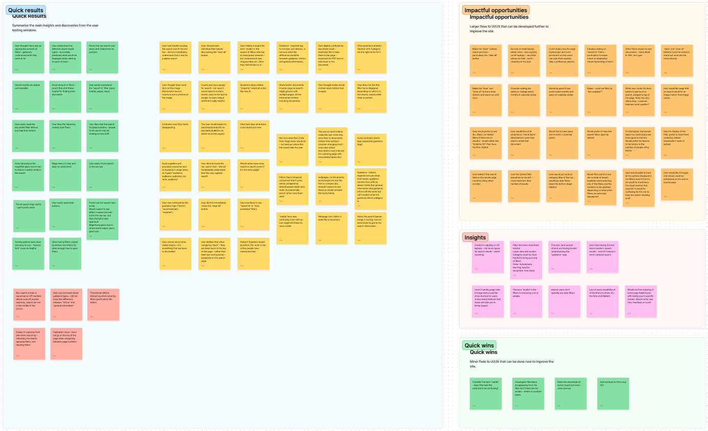
I collated and analysed the findings on a Figjam board. The most actionable data was organised into groups and prioritised for development changes.
Test feedback
User testing revealed technical bugs, simple usability improvements, and a few larger design changes we needed to make.
A key change was making the 'search in' option more prominent and user-friendly. I went through several design iterations, testing them with users. The final design was built using a customised version of algolia's hierarchy filter, allowing users to dig down to nested content types.
Summary
Outcomes - The new filter designs were added to the site, and feedback was generally positive.
What did I learn? - This was a great opportunity to develop UI for a very specific functionality.
- I explored how site searches come together and the technology used to build them (in this case, Algolia).
- I had the chance to test my designs multiple times, considering each round of user feedback to improve the next version. This taught me how to gather actionable insights from users and apply them to my design work.
- I learned the value of minimalism. It can be easy to overstuff your UI with information. Our final design is much simpler and more streamlined than earlier iterations.
Next steps - Going forward, we'll continue adjusting settings and reorganising filters to find the best balance for our audiences.